Friday, 31 March 2017

Significant 12 snipits from our Marmalady trailer that make it conform to a trailer


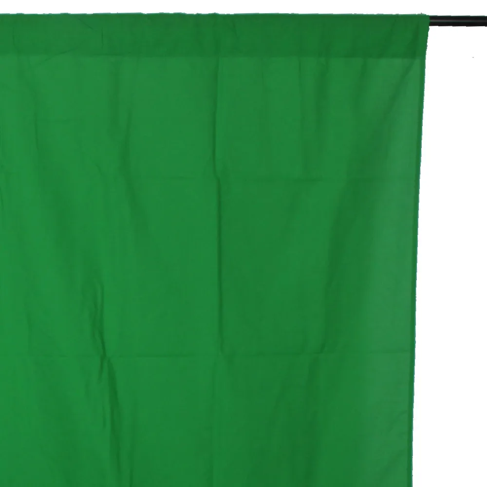
 Firstly, the institution titles conform to that of a trailer, and up the professionalism of the production. The centre placed titles and consistency flow with the trailer and conform to our trailers genre. The use of a personally created green band conforms to a trailer, as this is commonly shown at the start of a trailer. We made our own on the software "Paint.Net" as we just wanted to replicate both the red and green band into one. Many indie coming of age movies show a scene in which two people are at the beach, this was progressed into our trailer to suggest time over a long period of time, as it is evident that the seasons change as it is contrasted between a shot of the protagonist and love interest kissing with winter coats on, as opposed to swimwear at the start of the trailer, and during the montage. The use of the sock scene was also a factor in recognising it as a trailer, as most trailers use close up shots of body parts for transitioning to the next shot.

The close up shot of Sam mocking Lola is an evident portrayal of a trailer as this is where the fast pace music is cut off for the characters dialogue with a record scratching sound and enables the audience to laugh. The fast pace of the shots by its use of jump cuts and transitions apply to a trailer as it doesn't drag out the story, and keeps the key aspects of it, while intriguing the audience. The contrasted portrayal of the relationship between Ricky and Lola in the party scene and the Montage is evident in suggesting a trailer like production as this is suggesting a progression over time which is most commonly shown in trailers.

The final scene of protagonist Lola lying on the grass is the most important scene of all in suggesting a trailer, as this is shown as a reflection over the past few minutes shown through trailer, however longer period of time for the protagonist. This is commonly used in movies or music videos where the one who has prevalence is shown beginning and ending the production, by seeing them begin in a different light to how they've ended out as. This is overlayed with narration of the protagonist saying "Growing up is finding out who you are and what you want" making that the most recognisable phrase throughout the film. Once she has finished with the narration, we are shown the movie title "Marmalady"suggesting its trailer-esque portrayal, followed by the institution logo and quick paced credits, finishing with a "Coming soon" there foreinferring that it will be out in cinemas shortly.

Post production editing for Marmalday


Here it shows how we put together our final trailer. We used a large amount of different audio media so we could fill in every aspect, from soundtrack, to dialogue, to background noises. in this screenshot, it is visible that we used keys to change levels of the sound that suit best the shot. For example where you can see the cursor point line of where its playing, there are small dot on the blue audio, this was where we changed the levels with the dialogue, we decreased the sound when no one was speaking as this was audio from our Camera and it picked up a lot of noise. This was a difficulty in our post production.


This is the texting scene, where you can see we have overlapped text and the green boxes symbolise t sound effects that we put to create the sounds of I messages being sent and received.


Since our AS production, our knowledge in editing has increased due to excessive amounts of research and tutorials, and subsequently learning as we go along. A lot of the editing proceeded was improvised whilst experimenting different techniques. A large factor to our editing was the split screen, in which we had to crop the image and then zoom in for the close up of the split screen scene. This was  difficulty as we had to estimate the rough sizing of the shot and make it fit with the other footage displayed on the screen at the same time. A basic use of cross dissolve and fade to white or black was progressed throughout. For the first shot and introduction to the institution logo, we used a dissolve transition for the title, and decreased and set the speed to fit the washing of the waves, so it looked as if we deliberately placed it that way, and looked more professional.

Another struggle in our post production was the use of narration, we had to watch the trailer several times in order to find where certain parts of the dialogue would be placed, because it has to flow well with the sound of the soundtrack, and the transitioning between shot to shot. We also dubbed over the party scene with a post recorded voice memo that was recorded on our phones. This was due to copyright as we had popular songs playing in the background so we had to completely mute off the scene and cover it with a non-copyright busy bar soundtrack, along with the carefully placed dialogue we recorded over with. This was hard in the sense of getting it to match perfectly with the movement of the characters mouths, but subsequently this turned out just fine, and wasn't too noticeable.

MARMALADY COMMENTARY

Evaluating Editing choices for titles in Marmalday trailer A2 production


Evidently the Marmalady title was the most important to the Trailer, as it brings the Trailer together. We needed to pick a font that would symbolize both the protagonist and film.We did research on google and searched "Indie font download" and came across several potential fonts before choosing the final one which was titled "Shady Lane". We wanted to create an innocent and lighthearted atmosphere through the use of colour, however we didn't want to be dull and go for the common use of white, so we went for a baby blue colour, which connotes youth,and connotes summer as the sky is a baby blue color in summer which links to naturalistic locations Marmaldy is filmed in. This was additionally successful as the use of baby blue suggesting youth fit well over the narration followed through in the end scene where Lola reflects on what she's learnt throughout the movie. Evidently, Coming of age movies tend to have titles in different colours to enhance their individuality and quirkiness, white/ black font is typically progressed in Thrillers or Action movies as they don't want to use vibrant colours, as this would subvert their genre.
For the credits, we took a simple text that we had pre-downloaded a while ago in graphic design. We wanted to replicate the most common typography for credits, however, slightly conforming to our genre. We stuck to the theme of Baby blue as this looked good over the grass. In our credits, we firstly displayed the Actors names, followed with Writers, Directors and Producers, and lastly involving the names of the People who helped us create Marmalady with their own Soundtracks.

The "Coming Soon" title was a downloaded brush stroke effect, this conformed to our genre as the handwritten effect is primarily progressed in these type productions, connoting school life and youth due to its adolescence nature.

Brand identity in Marmalday 2

another aspect of creating a brand identity was how we personally created our own Green Band for our trailer, instead of downloading a copyrighted picture of a green band, we created our own template on "Paint.net" and followed the concept of both a Red band and a Green band, to convey to our chosen genre, we changes the text on our green band to"Indie filmmaker association of Surrey" so that it would conform to our independent coming of age movie genre which is what we wanted to achieve. We mimicked that of both of these trailer bands to create our own. You can see below the aspects we took from both of the bands to create a final product that looks realistic.


Annotated Marmalady official trailer

We have annotated the scenes in our film trailer describing the effect they have and why we chose to film the shots that way.

Our use of equipment for Marmalady evaluation

Image result for tripod
Image result for samsung nx1100 camera
Image result for green screen blanketImage result for canon 700dImage result for Led light These were significant equipment we used to create our A2 production, since our AS production we have gained a greater knowledge of how to use equipment effectively.We invested money from our budget on buying a green screen sheet that was able to fit 3 people in front of it.We chose to buy a green screen specifically for the making of our film poster as a green screen enables us to edit the back ground easily.We wanted to achieve a conventional film poster look for our genre after doing a lot of research we found that the majority of film posters have their backgrounds edited with green screens so that they can place their main characters in front of what ever they want. We chose to have Lola the protagonist as the main image with a light yellow back ground the color yellow connoting happiness, comedy and summer.Because of our green screen we were enabled to edit our background to how we wanted it we added to the background picture of marmalade jars and a sketched sun picture, we played with the colors of orange and turquoise.
We also invested our money into buying a LED light that we could attach to our camera, this was very useful as it allowed us to control the lighting of the scenes as we could increase and decrease the levels of lighting on the LED light on the side of it.Therefore it allowed us to film our scenes even in when it was dark outside.Our A2 production definitely progressed from our AS production in the aspect of lighting as we did not have any equipment to help us control lighting in our AS production therefore we only presented our audience with dim bedroom lighting. Also the shots in the attic were sometimes unclear due to lack of lighting used. Another equipment that we used in our A2 production that we did not use in our AS production was an additional camera , me and Eleanor decided to use both mine and her camera as this would allow us to get various kinds of shots at the same time it was also very convenient with timing as we could both film scenes separately when we were not together.This was a weakness in our AS production as we could only film with one camera so that we both had to take turns using it and we couldn't do any filming separately.